
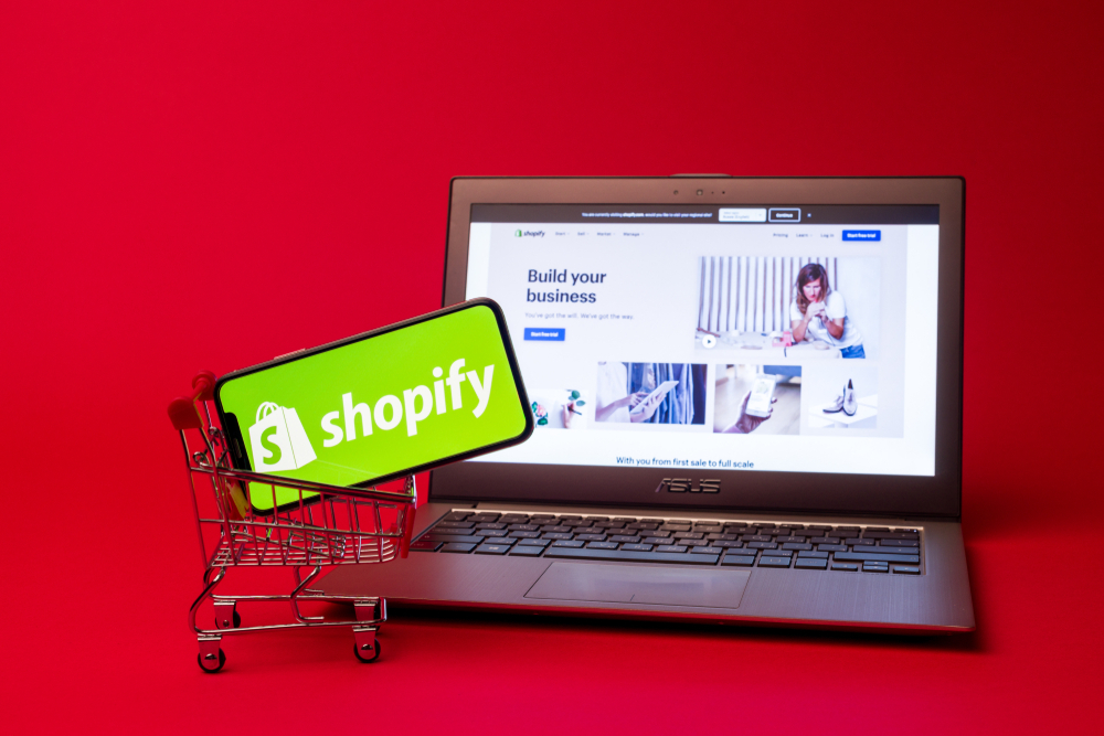
Mobile Commerce Mastery
In today’s digital age, mobile commerce has become increasingly prevalent. There are more and more consumers using smartphones and tablets to shop online. As a Shopify merchant, optimizing your Shopify store for mobile devices is essential to maximize sales. And, to also provide a smooth shopping experience for your customers. In this comprehensive guide, we’ll explore a range of strategies and tactics. They will help you master mobile commerce and unlock the full potential of your Shopify store.
1. Importance of Mobile Optimization for E-commerce:
Mobile optimization is crucial for e-commerce success. Because we are in a world where consumers are increasingly turning to their smartphones to shop online. With mobile devices accounting for a significant portion of web traffic and sales, making sure that your Shopify store is optimized for mobile devices is essential to reach and engage with your target audience effectively. Mobile optimization not only improves user experience but also contributes to higher conversion rates. Additionally, increased sales, and improved search engine rankings.
2. Choosing a Mobile-Responsive Shopify Theme:
Selecting a mobile-responsive Shopify theme is the foundation of mobile optimization for your store. Choose a theme that is designed to adapt seamlessly to different screen sizes and devices. Make sure that your store looks and functions perfectly on smartphones, tablets, and other mobile devices. Shopify offers a wide range of mobile-responsive themes that are optimized for performance and user experience. They let you create a visually appealing and mobile-friendly store with ease.
3. Streamlining Navigation and User Experience for Mobile Devices:
Streamlining navigation and user experience is essential for mobile optimization. Because mobile users have different viewing habits and expectations compared to desktop users. Simplify your site’s navigation menu and ensure that important links and categories are easily accessible from the main menu. Optimize page layouts and content hierarchy to prioritize key information and calls-to-action. Make it easy for users to find what they’re looking for and complete their purchase quickly and efficiently.
4. Optimizing Images and Multimedia for Mobile Viewing:
Optimizing images and multimedia content is critical for mobile optimization. Because as large file sizes and complex media can slow down page load times and detract from the user experience. Compress images and multimedia files to reduce file size without compromising quality. Also use responsive image techniques to ensure that images scale appropriately across different devices and screen sizes. Consider using lazy loading techniques to defer the loading of non-essential images and multimedia until they are needed. It further improves page load times and performance on mobile devices.
5. Implementing a Mobile-Friendly Checkout Process:
The checkout process is a crucial component of mobile optimization, as it directly impacts conversion rates and sales. Simplify the checkout process for mobile users. Reduce the number of steps required to complete a purchase and reducing form fields to only essential information. Optimize form fields and input fields for mobile devices. Make it easy for users to enter their information accurately and efficiently. Offer guest checkout options and enable autofill functionality to streamline the checkout process further and reduce friction for mobile users.
6. Utilizing Mobile-Specific Marketing Strategies such as SMS Campaigns:
Mobile-specific marketing strategies such as SMS campaigns are highly effective for reaching and engaging with mobile users on their preferred devices. Leverage Shopify apps or integrations to implement SMS marketing campaigns. They deliver targeted messages and promotions directly to customers’ mobile phones. Use SMS messages to send personalized offers, reminders, and updates. They also leverage mobile-specific features such as clickable links and interactive messages to drive engagement and conversions.
7. Leveraging Push Notifications for Engagement:
Push notifications are another powerful tool for engaging with mobile users and driving sales on your Shopify store. Implement push notification functionality using Shopify apps or integrations. Use them to deliver timely and relevant messages to users’ devices. Send push notifications to notify users of new product launches, special promotions, or abandoned carts. Alo use personalized messaging and targeting to increase engagement and conversion rates. Be mindful of frequency and timing when sending push notifications to avoid overwhelming users and negatively impacting the user experience.
8. Incorporating Mobile Payment Options for Convenience:
Offering mobile payment options is essential for catering to the preferences and needs of mobile users. They aso help in streamlining the checkout process on your Shopify store. Integrate popular mobile payment methods such as Apple Pay, Google Pay, and PayPal. They provide customers with convenient and secure payment options that are optimized for mobile devices. Display mobile payment icons prominently on product pages and the checkout page. They encourage users to choose mobile payment options and complete their purchase quickly and easily.
9. Optimizing Site Speed for Mobile Devices:

Site speed is a critical factor in mobile optimization. Slow-loading pages can frustrate users and lead to high bounce rates and abandoned carts. Optimize your Shopify store for speed by reducing HTTP requests, taking advantage of browser caching, and optimizing server response times. Compress and optimize images, scripts, and multimedia files to reduce file size and improve load times. Also prioritize content that is essential for the user experience. Monitor site speed using tools like Google PageSpeed Insights or Shopify’s built-in analytics to identify areas for improvement. You may then optimize performance for mobile devices.
10. Implementing App Integrations for Mobile Functionality:
Take advantage of Shopify’s extensive ecosystem of apps and integrations. They enhance mobile functionality and provide additional features and capabilities for your mobile users. Explore Shopify’s App Store to discover apps that offer mobile-specific features. Examples are live chat support, mobile optimization tools, and mobile analytics dashboards. Choose apps that align with your mobile optimization goals. Integrate them seamlessly with your Shopify store, letting you to provide a superior mobile experience for your customers.
11. Testing Your Site Across Various Mobile Devices and Browsers:
Testing your site across various mobile devices and browsers is essential to ensure compatibility and usability for all users. Conduct complete testing on a range of devices. That includes smartphones, tablets, and different screen sizes, to identify any issues or inconsistencies. They include your site’s layout, functionality, or performance. Test your site on popular mobile browsers such as Safari, Chrome, and Firefox. Address any compatibility issues or rendering errors that may arise. Consider using device emulators or testing services to simulate real-world conditions and ensure a smooth experience for mobile users.
12. Monitoring Mobile Analytics for Insights:
Monitoring mobile analytics is essential for understanding user behavior, tracking performance, and identifying opportunities for optimization on your Shopify store. Use Shopify’s built-in analytics tools or third-party analytics integrations to track key metrics such as mobile traffic, conversion rates, bounce rates, and average order value. Analyze user engagement and navigation patterns to identify areas of improvement and optimize your site’s mobile experience accordingly. Use data-driven insights to make informed decisions and prioritize initiatives that will drive the greatest impact on mobile sales and conversions.
13. Utilizing AMP (Accelerated Mobile Pages) for Faster Load Times:
Accelerated Mobile Pages (AMP) is a technology that allows you to create lightweight and fast-loading versions of your website’s pages for mobile devices. Implement AMP on your Shopify store to improve load times and performance for mobile users, particularly for content-rich pages such as product listings, blog posts, and category pages. AMP pages load almost instantly and provide a seamless browsing experience for mobile users, reducing bounce rates and increasing engagement and conversions. Leverage Shopify apps or integrations to implement AMP functionality and optimize your site for mobile search visibility and user experience.
14. Designing Thumb-Friendly Buttons and Interactive Elements:
Designing thumb-friendly buttons and interactive elements is essential for mobile optimization, as mobile users interact with touch screens using their thumbs and fingers. Ensure that buttons and interactive elements are large enough and adequately spaced to be easily tappable on mobile devices, and place them within easy reach of the user’s thumb for maximum usability.
Use clear and concise labels and visual cues to indicate interactive elements and guide users through the mobile experience seamlessly.
15. Utilizing Geolocation for Personalized Experiences:
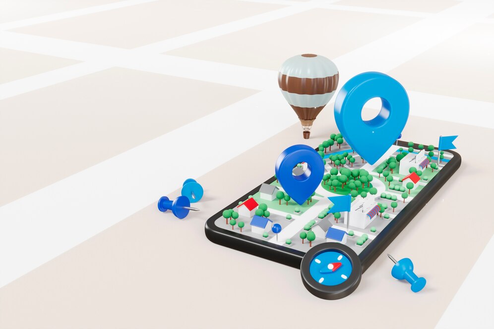
Geolocation technology allows you to deliver personalized experiences and targeted content to users based on their geographic location. Leverage geolocation data to customize the user experience for mobile users by displaying location-specific offers, promotions, and recommendations that are relevant to their area. Use Shopify apps or integrations to implement geolocation functionality and segment users based on their location, allowing you to deliver hyper-targeted messaging and promotions that resonate with mobile users in specific regions or markets.
16. Implementing Mobile-Specific SEO Tactics:
Optimizing your Shopify store for mobile search is essential for maximizing visibility and attracting organic traffic from mobile users. Implement mobile-specific SEO tactics such as optimizing meta tags, titles, and descriptions for mobile search, and ensuring that your site’s content is crawlable and indexable by mobile search engines. Use responsive design techniques to create a mobile-friendly site architecture and ensure that your site loads quickly and performs well on mobile devices. Leverage structured data markup to provide search engines with additional context and information about your site’s content, and monitor mobile search rankings and performance using SEO tools and analytics.
17. Creating Content Tailored to Mobile Users:
Creating content tailored to mobile users is key to engaging and converting mobile shoppers on your Shopify store. Craft concise and visually appealing content that is optimized for mobile consumption, including product descriptions, blog posts, and landing pages. Use bullet points, short paragraphs, and bold headings to break up text and make it easier to read on small screens, and use high-quality images and multimedia to enhance visual appeal and engagement. Tailor content to address mobile-specific needs and preferences, such as on-the-go browsing, quick decision-making, and touch-based interaction.
18. Utilizing Social Media Platforms Popular Among Mobile Users:
Social media platforms are a valuable channel for reaching and engaging with mobile users and driving traffic to your Shopify store. Leverage popular social media platforms such as Facebook, Instagram, Twitter, and Pinterest to share product updates, promotions, and content with your audience. Create mobile-friendly content that is optimized for sharing on social media, including images, videos, and interactive posts, and use hashtags and tags to increase visibility and reach. Engage with your audience actively on social media, responding to comments and messages promptly, and fostering relationships with followers to drive loyalty and advocacy.
19. Addressing Common Mobile Usability Issues:
Addressing common mobile usability issues is essential for providing a seamless and enjoyable shopping experience for mobile users on your Shopify store. Identify and resolve common issues such as slow load times, small text and buttons, and non-responsive design elements that detract from the user experience. Conduct usability testing and gather feedback from real users to identify pain points and areas for improvement, and prioritize fixes and enhancements that will have the greatest impact on mobile usability and satisfaction.
20. Incorporating Voice Search Optimization Strategies:
Voice search optimization is becoming increasingly important as more consumers use voice-enabled devices such as smartphones, smart speakers, and virtual assistants to search for products and information online. Incorporate voice search optimization strategies into your Shopify store by optimizing content for natural language queries and conversational search terms. Use long-tail keywords and phrases that mimic spoken language, and structure content in a way that answers common questions and provides relevant information to voice search users. Monitor voice search trends and adapt your SEO strategy accordingly to capitalize on this emerging trend and drive more traffic and sales to your Shopify store.
21. Staying Updated on Mobile Technology and Trends:
Staying updated on mobile technology and trends is essential for maintaining a competitive edge and maximizing success on your Shopify store. Keep abreast of the latest developments in mobile devices, operating systems, and mobile applications, and stay informed about emerging trends and consumer behavior patterns related to mobile commerce. Follow industry news, blogs, and publications, and participate in relevant forums, webinars, and events to stay ahead of the curve and identify opportunities for innovation and growth in the ever-evolving landscape of mobile commerce.
Conclusion:
Optimizing your Shopify store for mobile devices is essential for maximizing sales, improving user experience, and staying competitive in today’s mobile-first world. By following the strategies and tactics outlined in this guide, you can master mobile commerce and unlock the full potential of your Shopify store. From choosing a mobile-responsive theme and streamlining navigation to implementing mobile-specific marketing strategies and addressing common usability issues, there are many steps you can take to ensure that your Shopify store is optimized for success on mobile devices. By prioritizing mobile optimization and staying updated on mobile technology and trends, you can create a seamless and enjoyable shopping experience for mobile users and drive growth and revenue for your business.
